Nova Dark Icon Pack
- 4.7
- Rating
- 10.00K
- Installs
- $3.49
- Price
 Analysis by App-foxy
I spent time using Nova Dark Icon Pack as a homescreen customization tool, and my first impression was clear: this is aimed at people who want their Android setup to look deliberately dark rather than simply switching on the system’s dark theme. It is a personalization app from One4Studio, built around changing the visual identity of app icons instead of altering the whole phone interface.
That distinction matters. A dark system theme can make menus and supported apps easier on the eyes, but it does not necessarily make a homescreen feel consistent. An icon pack works at the surface level you see every time you unlock the phone. In my experience, that makes the result more noticeable than many small wallpaper or widget tweaks, although the final quality depends heavily on the launcher being used and on how many installed apps receive a matching icon.
How the dark icon approach feels in daily use
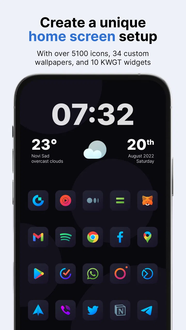
The pack’s appeal is its visual direction: a darker icon treatment that can make a bright, mixed collection of app logos feel calmer. Instead of having red, blue, green and white symbols competing for attention, I could move toward a more restrained homescreen. That is especially useful if you already use a dark wallpaper, a minimal widget layout or a phone theme built around black and charcoal tones.
You May Also Like

 Blood Strike: 2.5 Anniversary
Blood Strike’s Loadouts Turn Every Drop Into a Tactical Gamble
A close look at Blood Strike’s custom loadouts: how fast access to signature weapons reshapes its battle royale rhythm, rewards preparation, and narrows the gap between fights.

 Pandora - Music & Podcasts
Pandora’s Music Is Easy to Start, but Harder to Recover
Pandora’s strength is its low-effort path from a seed to a station. Its weak spot is how much confidence it asks you to place in connection, setup, and quiet recovery.

 8 Ball Pool
 Is Built on Rivalries, Rematches, and Routine
A close look at the rivalries, rematches, shared routines, and unanswered safety questions that turn a quick pool match into a persistent mobile community.

 Samsung Music
’s Quiet Strength Is Playing What You Already Own
Its reach comes less from spectacle than from dependable access to a personal library. That simplicity is both the app’s strongest retention engine and its ceiling.

 AccuWeather: Weather Radar
AccuWeather Review: A Quick, Clear Forecast for Everyday Decisions
For everyday plans, the best forecast is the one you can understand quickly. AccuWeather makes rain timing, radar, and local conditions easy to act on, with a few trade-offs.

 Hill Climb Racing
Why Hill Climb Racing Still Turns Crashes Into One More Run
A tiny car, a bumpy hill and one more upgrade: Hill Climb Racing keeps resurfacing because its simple chaos makes every near-miss feel personal.
More From Our News Desk
View All News


I would not describe this as a complete phone makeover by itself. It changes the icons, not every element around them. The launcher, wallpaper, widget colors, folder appearance and notification shade still influence the overall result. The best outcome comes from treating the pack as one part of a setup rather than expecting it to redesign the entire device automatically.
One practical strength is that an icon pack can make a busy homescreen easier to scan. When the icon shapes and tonal range are more uniform, I found myself relying more on position and label recognition than on the original brand colors. That may sound minor, but it can make a carefully arranged first page feel less visually noisy.
There is also a trade-off. Original app colors are useful recognition shortcuts. If you instantly identify a service by its familiar bright logo, a darker replacement may slow you down at first. I think the pack works best for users who value visual consistency more than immediate color-based recognition.
What I would check before installing
The most important compatibility question is the launcher. Icon packs are not equally convenient across every Android home replacement, so I would check whether your current launcher can apply custom icon packs before paying. If you already use a launcher with an icon-pack selection screen, the setup should be more straightforward. If your phone’s default launcher offers limited customization, the app may not deliver the experience you expect.
I would also look at your installed-app mix. A themed icon pack is most convincing when the apps you use every day have coordinated icons. If many of your essential apps remain unchanged, the homescreen can end up with a dark majority surrounded by a few bright holdouts. That is not necessarily a failure, but it changes the look from “fully unified” to “intentionally mixed.”
A useful workflow is to start with the first homescreen page rather than trying to redesign everything. Apply the pack, keep only the apps you use most often, and see whether the darker style helps or hurts recognition. This quick test tells you more than judging the pack in isolation, because the result depends on your wallpaper, grid size and launcher spacing.
Another tip is to keep one familiar app arrangement while testing. Moving icons and changing the visual style at the same time makes it difficult to know what is actually improving your experience. I prefer changing one variable first, then deciding whether folders, widgets or a new wallpaper are worth adjusting.
Cost, access and what the purchase means
Nova Dark Icon Pack is listed at $3.49, so I see it as a paid customization purchase rather than a free experiment. That price makes the decision fairly simple for someone who already knows they enjoy dark icon themes, but it is less attractive if you are only curious about changing your homescreen for a few minutes.
The app also lists in-app purchases ranging from $1.99 to $59.99 per item. Because those are separate purchase amounts associated with the app, I would pay attention to the checkout screen and the exact item being selected rather than assuming every part of the experience is covered by the listed app price. For a small visual customization, clarity about what you are buying is important.
In value terms, the purchase is not about adding productivity tools or functional phone features. You are paying for a visual treatment that you may look at hundreds of times a day. That can be worthwhile when the style matches your taste and your launcher supports it well. It is poor value if you frequently change themes, rarely use the homescreen, or are satisfied with the default icons.
I would compare it with free icon packs and launcher themes before buying, but not only by asking which option costs less. Free alternatives may be enough if you want to experiment, while a paid pack can be worthwhile when you prefer a particular visual language and want to keep it for a long time. The real question is whether this specific dark presentation feels more polished to you than the free choices you have already tried.
Where it fits among normal personalization options
Compared with changing only the wallpaper, an icon pack creates a stronger sense of consistency. A wallpaper affects the background, while the icons remain the repeated visual elements you interact with. Compared with a full launcher theme, however, this is a narrower change. A launcher can influence gestures, layout, folders and other behavior, whereas Nova Dark focuses on the icon layer.
That narrower focus is actually a benefit for people who like their current launcher. I did not need to rethink the entire way I navigate the phone just to pursue a darker homescreen appearance. If you are happy with your launcher’s gestures and organization, an icon pack is less disruptive than replacing the launcher altogether.
On the other hand, users who want a complete black-and-white setup may find the pack insufficient on its own. The surrounding widgets may still use bright colors, and unthemed apps can stand out. In that situation, a broader launcher theme or a coordinated wallpaper-and-widget setup may be the better purchase, even if the icon pack itself looks good.
The Android requirement is also worth noting. The app supports devices running Android 8.0 or later, which covers a broad range of phones but still excludes older hardware. For a modern Android user, that requirement should not be a major obstacle, but owners of older devices should check their system version before spending money.
Small details that affect the finished homescreen
Icon packs are judged less by a single icon than by the rhythm of a whole page. I paid attention to whether the icons looked comfortable together at the same size, whether labels remained readable, and whether folders looked noticeably different from individual apps. These details matter because a dark design can look elegant in a preview but become muddy when several icons are placed close together.
I also recommend testing the pack with your usual icon size rather than immediately enlarging everything. Larger icons can make a theme feel more dramatic, but they reduce the number of apps visible at once. Smaller icons preserve information density but may make darker details harder to distinguish. The right choice depends on whether your priority is a clean appearance or quick access to many apps.
For a workday setup, I would use the darker treatment on a first page containing communication, calendar and task shortcuts, then leave less-used apps in folders. This keeps the visual change focused where it matters most. For a personal phone, you might prefer a more expressive arrangement with a large clock widget and fewer icons, where the dark style becomes part of the overall composition.
There is a useful practical distinction between a theme that looks good in a screenshot and one that remains comfortable after repeated use. A screenshot rewards symmetry and contrast. Daily use rewards quick recognition, readable labels and predictable placement. I would choose the pack only if it succeeds at the second test, not merely the first.
Who is likely to get the most from it
I think this app suits Android users who already enjoy customizing their homescreen and have a launcher that handles icon packs properly. It is particularly appealing if your wallpaper is dark, your widgets are restrained, and you dislike the visual clutter created by unrelated app logos.
It can also work well for someone who wants a more mature or subdued phone appearance without changing navigation habits. If you use your phone in dim rooms and find a wall of bright icons distracting, a darker visual layer may feel more comfortable, although the actual effect will depend on your display settings and the rest of your theme.
The app is less suitable for people who want every installed app to look exactly the same with no manual attention. Any icon-pack experience can be weakened by apps that do not match, and I would not buy this expecting a universal solution to every homescreen inconsistency. It is also not the right choice if your main goal is new gestures, advanced organization or deeper system-wide theming.
New Android users should be especially realistic about the setup. If you have never used a custom launcher or icon pack, the process may involve learning where your launcher stores theme settings. That learning curve is not necessarily difficult, but it means the purchase is better for someone willing to spend a little time arranging the result rather than expecting a single tap to finish everything.
Longevity, updates and everyday practicality
The app was released on November 19, 2019, and its current version is 7.3.6. I read that as a sign that the project has continued beyond its initial release, which is relevant for an icon pack because Android users keep installing new apps over time. A theme is more useful when it remains part of an ongoing setup instead of feeling like a one-week experiment.
Still, longevity does not remove the need for personal testing. Your phone model, launcher and collection of apps determine how convincing the result will be. I would install it with the expectation of evaluating my own homescreen, not assuming that a continued version history guarantees perfect coverage for every app I use.
The age rating is Everyone, which fits the nature of a visual personalization tool. I would not choose or reject it based on family content concerns; the meaningful decision points are compatibility, appearance and whether the paid price feels justified for your habits.
The app has an average rating of 4.7 from 638 ratings, with 96 reviews, and it has passed 10K+ installs. Those figures suggest that the pack has found an audience, but they should not replace a compatibility check. A highly rated icon pack can still be a poor match for a launcher that does not support it well or for a user who depends heavily on original logo colors.
My buy-or-skip recommendation
I would buy Nova Dark Icon Pack if I had three things in place: a compatible Android launcher, a genuine preference for dark visual design, and a willingness to spend time refining the homescreen. In that situation, the paid price can make sense because the result is visible every time I unlock the device, and the change is more substantial than simply downloading another wallpaper.
I would skip it if I were looking for a free, low-commitment experiment, if my launcher could not apply custom icon packs, or if I needed a complete system theme rather than a focused icon treatment. I would also skip it if bright original logos are essential to how I find apps quickly. A darker interface is not automatically a more usable interface.
My final view is positive but conditional. This is a focused personalization purchase from One4Studio, not a general-purpose Android enhancement. Its value comes from consistency: when the wallpaper, widgets, layout and launcher already support a dark look, the icons can pull the homescreen together. When those pieces point in different directions, the pack may feel like an attractive layer placed on top of an unfinished design.
My recommendation: buy it for a deliberate dark homescreen, skip it for broad launcher features or a risk-free free trial. Before paying, check your launcher, test how quickly you recognize your most-used apps, and judge the complete first page rather than one attractive icon. That small preparation will tell you whether this particular $3.49 customization is likely to become part of your daily phone experience or just another theme you remove after a few days.
FAQs for Nova Dark Icon Pack
01What is Nova Dark Icon Pack, and what does it do?
Nova Dark Icon Pack is a customization app that replaces standard app icons with a coordinated dark-themed design. It is intended to give your Android home screen a cleaner, more consistent appearance, especially when paired with a dark wallpaper or system theme. After installation, you can browse the available icons, apply the pack through a compatible launcher, and customize individual icons when supported.
02Which launchers are compatible with Nova Dark Icon Pack?
Compatibility depends on the launcher installed on your Android device. Nova Dark Icon Pack is generally designed for popular third-party launchers that support icon packs, such as Nova Launcher and other well-known alternatives, although the exact list may vary by version. Before downloading, check the app’s compatibility information and confirm that your launcher allows external icon themes or manual icon replacement.
03Can I use Nova Dark Icon Pack without Nova Launcher?
You may be able to use Nova Dark Icon Pack without Nova Launcher if your current launcher supports third-party icon packs. Many Android launchers offer an icon theme option in their appearance or home-screen settings, but some manufacturer launchers do not support this feature. If automatic application is unavailable, you might still use individual icons through a launcher that permits custom shortcuts.
04Does Nova Dark Icon Pack include icons for every application?
No icon pack can guarantee coverage for every application, particularly newer, regional, or less popular apps. Nova Dark Icon Pack usually includes a broad selection of themed icons, but unsupported apps may keep their original appearance or require a manual alternative. Depending on the launcher, you may be able to request missing icons, use a similar icon from the pack, or create a custom shortcut.
05Is Nova Dark Icon Pack free, and are there any limitations?
The price and available features can depend on the version distributed through the app store. Some editions may be free, while others can include advertising, optional purchases, or premium features. Before installing, review the current store listing for pricing, permissions, update history, and compatibility details. Also remember that applying the pack may require a separate launcher with its own free or paid features.
Pros
- Elegant dark icons give home screens a polished
- consistent look.
- Large icon library covers many popular apps and games.
- Includes alternative icon styles for extra customization.
- Cloud-based wallpapers complement the pack’s overall aesthetic.
- Easy icon requests help expand support for missing applications.
Cons
- Some less popular apps may still lack matching custom icons.
- The dark palette can reduce visibility on certain wallpapers.
- Full features may require an in-app purchase.
- Updates and new icon additions may not arrive regularly.
- Requires a compatible launcher for applying icons outside supported tools.

Nova Dark Icon Pack
Gallery